> ## Documentation Index
> Fetch the complete documentation index at: https://docs.hipocap.com/llms.txt
> Use this file to discover all available pages before exploring further.
# Custom Dashboards
 ## What You Can Track
Custom Dashboards are built on top of our powerful query engine, working across all your observability data - `traces`, `spans`, `events`, and `tags`. You can track any metric that matters to your application.
For detailed information on available entities, fields, and how to select the right data for your charts, see the [SQL Editor Reference](/sql-editor/reference).
## How to Build Charts
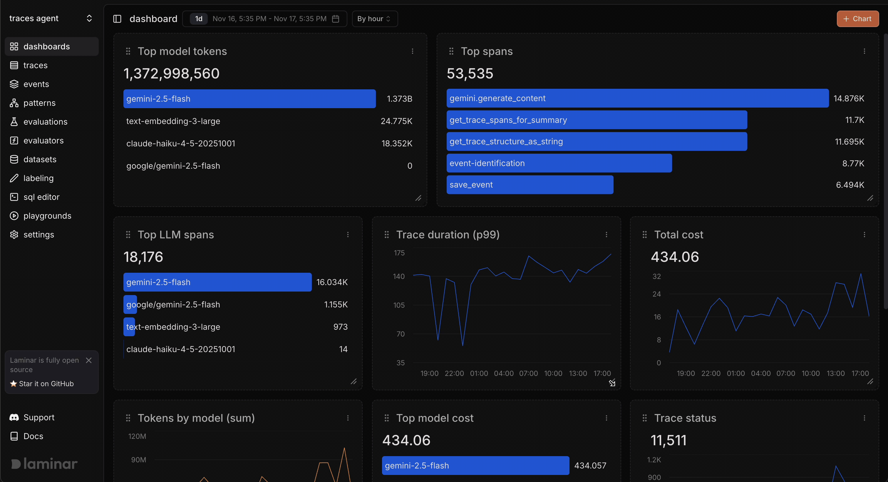
To create a chart, navigate to **dashboard** menu and click the **`+ Chart`** button in the upper right corner.
## What You Can Track
Custom Dashboards are built on top of our powerful query engine, working across all your observability data - `traces`, `spans`, `events`, and `tags`. You can track any metric that matters to your application.
For detailed information on available entities, fields, and how to select the right data for your charts, see the [SQL Editor Reference](/sql-editor/reference).
## How to Build Charts
To create a chart, navigate to **dashboard** menu and click the **`+ Chart`** button in the upper right corner.
 **The process:**
1. **Pick visualization**:
* **Line Chart**: For time series visualization. We automatically prefill and group data by time range, perfect for tracking trends over time.
* **Bar Chart**: Another alternative to visualize time series data, useful when you want to emphasize individual time periods.
* **Horizontal Bar Chart**: For visualizations that need to be ranked, similar to a sortable table. Use this to compare and rank items (e.g., top users, models by cost).
2. **Select data source**: Traces, Spans, Events, and Tags
3. **Define metrics**: What to measure (count, sum, avg, min, max, p90, p95, p99)
4. **Add context**: Filters to narrow scope, grouping to break down by dimensions, order by fields, limits for top N results
5. **Save and customize**: Add to dashboard, resize as needed
## Examples
### Total Tokens by Model
See which models consume the most tokens to identify where your LLM costs are going. Use this to decide if you're using the right model for each use case.
**The process:**
1. **Pick visualization**:
* **Line Chart**: For time series visualization. We automatically prefill and group data by time range, perfect for tracking trends over time.
* **Bar Chart**: Another alternative to visualize time series data, useful when you want to emphasize individual time periods.
* **Horizontal Bar Chart**: For visualizations that need to be ranked, similar to a sortable table. Use this to compare and rank items (e.g., top users, models by cost).
2. **Select data source**: Traces, Spans, Events, and Tags
3. **Define metrics**: What to measure (count, sum, avg, min, max, p90, p95, p99)
4. **Add context**: Filters to narrow scope, grouping to break down by dimensions, order by fields, limits for top N results
5. **Save and customize**: Add to dashboard, resize as needed
## Examples
### Total Tokens by Model
See which models consume the most tokens to identify where your LLM costs are going. Use this to decide if you're using the right model for each use case.
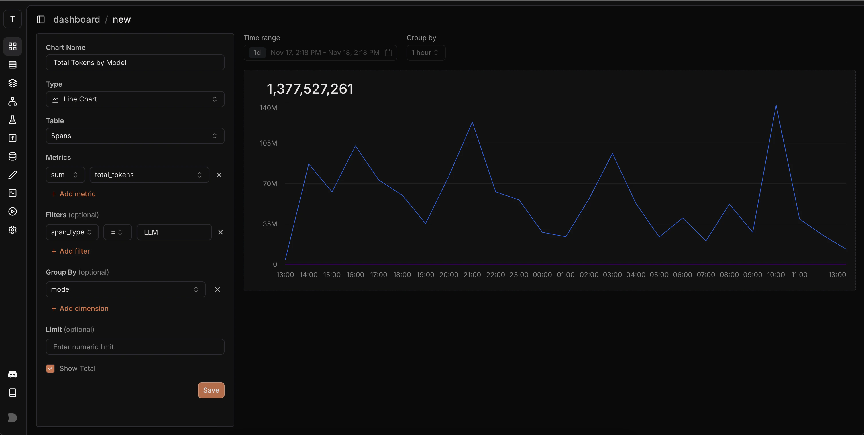 **How to build:**
* Chart type: Line Chart
* Table: `spans`
* Metric: `total_tokens` with `sum` aggregation
* Group by: `model`
* Filter: `span_type` = `LLM` (to include only LLM calls)
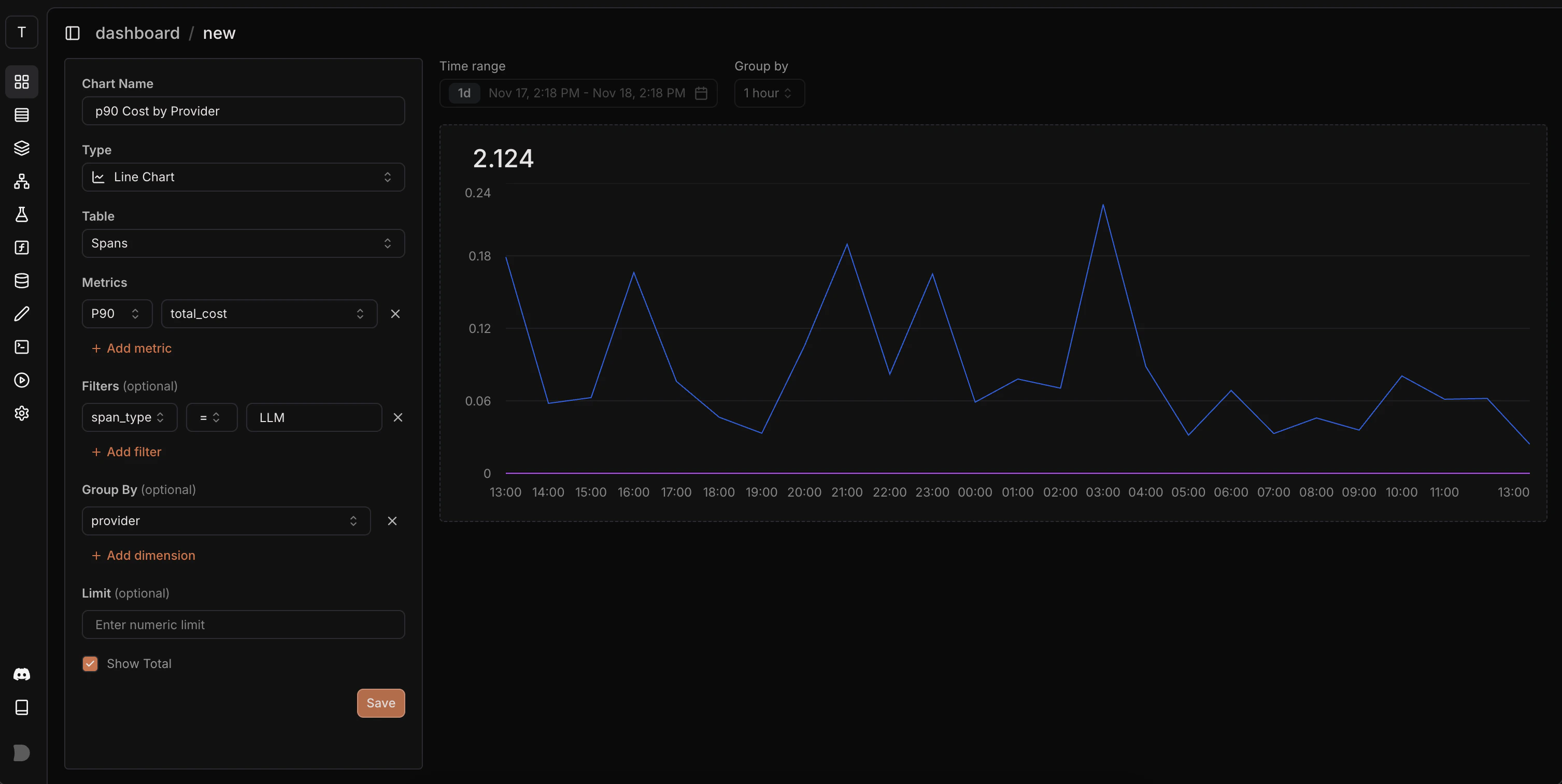
### p90 Cost by Provider
Track cost trends across different LLM providers over time. The p90 metric shows what most of your expensive requests cost, helping you compare provider pricing and spot cost increases.
**How to build:**
* Chart type: Line Chart
* Table: `spans`
* Metric: `total_tokens` with `sum` aggregation
* Group by: `model`
* Filter: `span_type` = `LLM` (to include only LLM calls)
### p90 Cost by Provider
Track cost trends across different LLM providers over time. The p90 metric shows what most of your expensive requests cost, helping you compare provider pricing and spot cost increases.
 **How to build:**
* Chart type: Line Chart
* Table: `spans`
* Metric: `cost` with `p90` aggregation
* Group by: `provider`
**How to build:**
* Chart type: Line Chart
* Table: `spans`
* Metric: `cost` with `p90` aggregation
* Group by: `provider`